These past two weeks I have been working my but off to finish this comic and send it off to the printer. Which I did last Monday and I now have a proof!
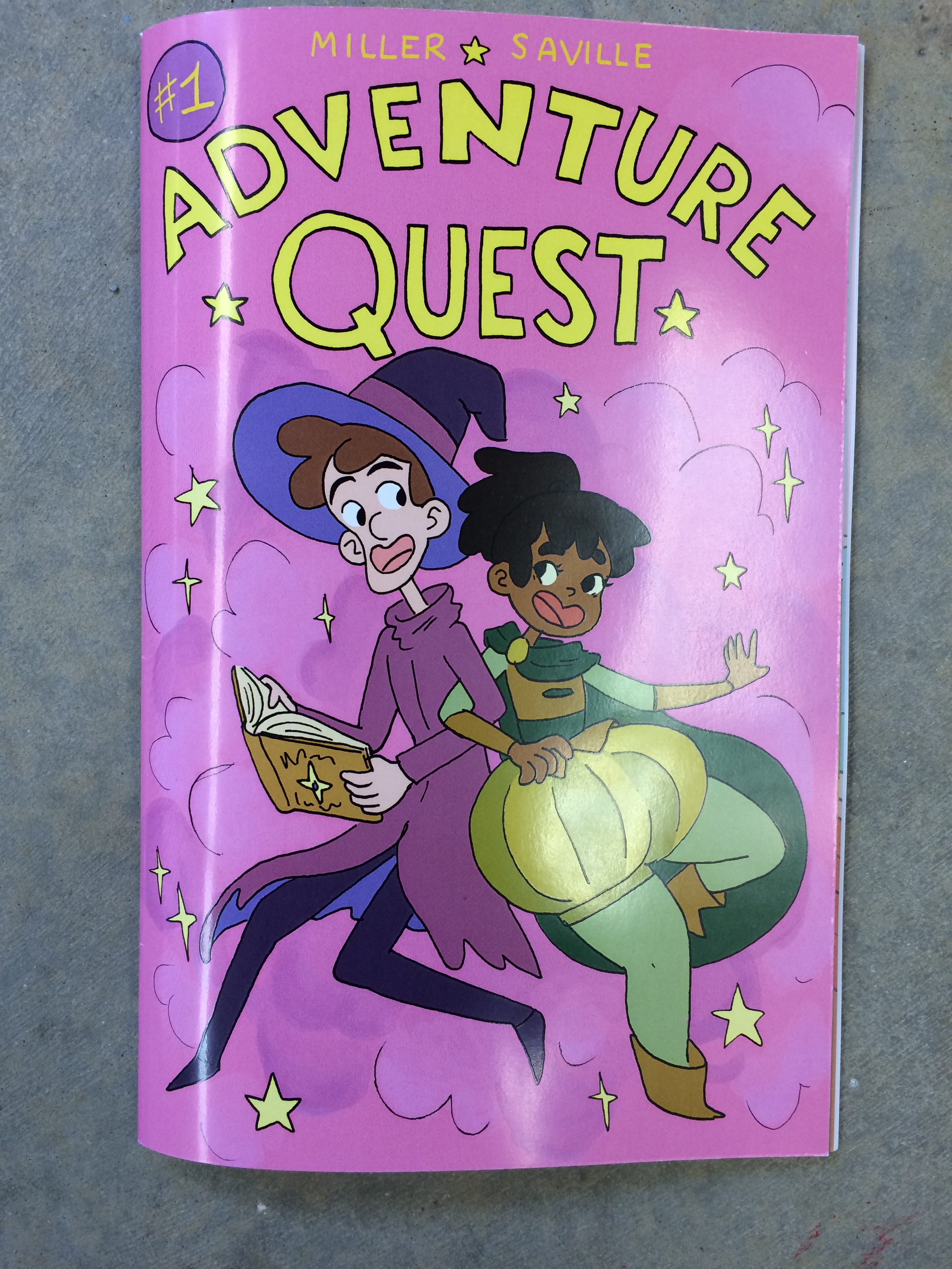
These past two weeks I have been working my but off to finish this comic and send it off to the printer. Which I did last Monday and I now have a proof!
I’ve spent most of this break coloring my inked pages that I scanned in last week. As I’m typing this, I am 67% done coloring; having complete 32 of 48 pages, by the end of the night this will likely have increased to 34 pages.
With the help of my trusty friend Anna, my current page per day output is 6.4. Usually, it takes me between 1-2 hours or so per page. (according to my audible app I listened to 8 hours yesterday so I’m going at this pretty hard) The next step is to layout the type in InDesign. I’m estimating this process to take a lot less time per page; since most of it will consist of typing up words I’ve already written and drawing word bubbles.
If I stay on track and don’t burn out, I plan to turn my book over to the printers in a week. But if something unforeseen happens, I still have a weeks worth of wiggle room to submit the comic for print before we install into the gallery.
Here are some of my favorite pages so far:


It is hard to believe I’m almost done. I can see the end of this. I can do this.
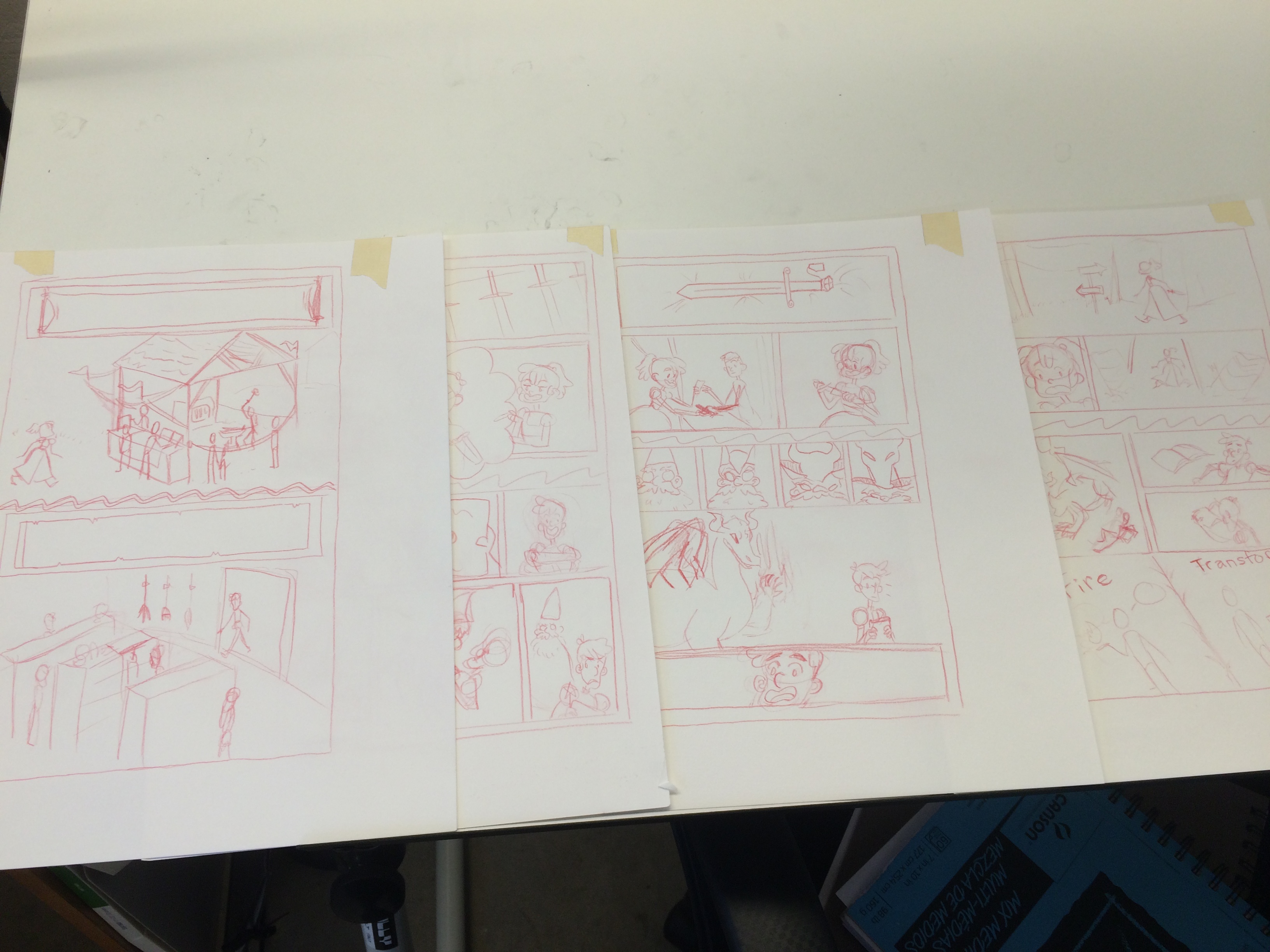
Last weekend I finally finished the big roughs for my comic. The page count came to a total of 49 pages. Since then I’ve been working to transfer all those pages onto the good paper with red pencil. So far, I’m halfway done with 25 pages done in the red pencil and 10 or so pages inked.

In the coming week, I’m planning on completing the red pencil transfers as well as having at least half the pages inked. Then I will move on to starting to scan and color the pages. I have most of the colors figured out for each section of the story and I’m planning to enlist the help of friends to help color the flats for the pages.
In the next week, I also plan to experiment with font and text layout on finished inked pages. I am not sure if it is best to layout the text before or after the coloring. I feel that after may be better, since then I will only have to flatten the image once to layout the text in inDesign.
As I was moving along with inking pages of the comic I soon realized the brush pen I love so much is a bit finicky. After inking with it for an hour or so the ink begins to flow very quickly, leading it to become hard to control. In a perfect would I would fix this by simply taking breaks, but I don’t have time to do that. So I made the decision to switch from using the brush pen to normal felt tip micron pens. Below are examples of pages inked both ways.


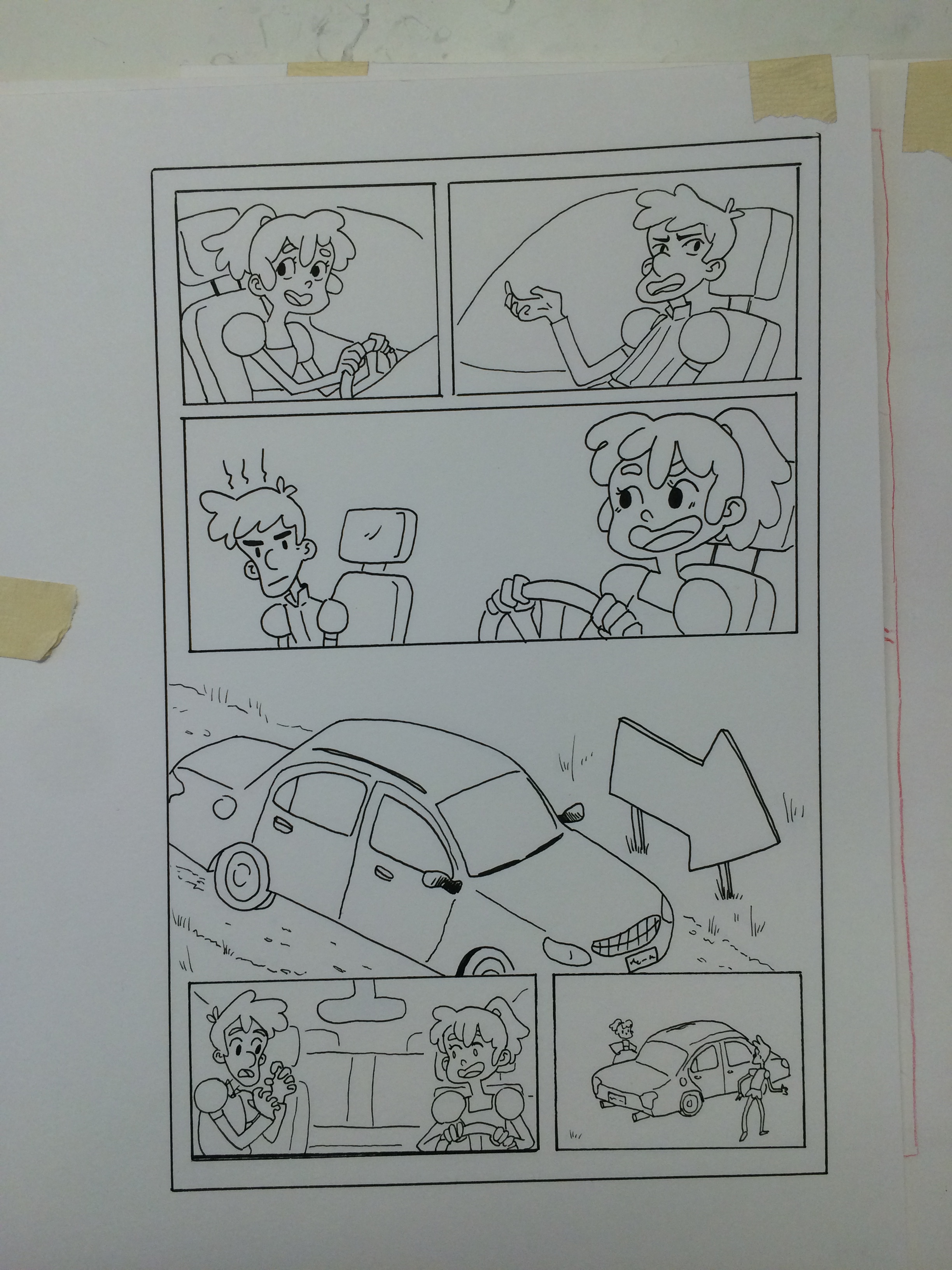


Here are is a photo of some of the pages I have waiting to be inked.
Sorry for the lack up update over the weekend. I got a bad cold on Saturday and it slipped my mind to update the blog. But in spite of being sick I got a bunch done this weekend to show.
First I edited a few of the color keys that weren’t as strong.


Since my last post I’ve been moving forward on finalizing the color for the comic. At first I decided to jump into a rough color script, by painting over some of my thumbnails, but I found that this was jumping the gun a little bit because I had still yet to figure out the overarching color story of the whole comic.

I then moved on to establishing color keys for all the important locations of the story. While not all of them are perfect I think I’m moving in the right direction finalizing the look I want of the comic.

After a critique in class on my color keys, people responded much more to the ones with a definite light source. And the ones without them, like the top left and third down on the left, where liked as much. I also personally don’t like the second down on the right and the bottom left key. All of the keys are close, but I want to make sure to get them just right. I have to do the final tweaking to make them perfect.
I’ve been in the process of experimenting with color for the comic. After a general conststice from my review to go simpler I started looking out for examples of uses of color I really like.
The first place I started was with Fraction’s run of Hawkeye. In the back of the volumes they always have some extra content, and in the back of Little Hits, Matt Hollingsworth talks about how he lays out the colors for each issue. He says that he and Fraction only like dealing with 2-3 main colors, in this case purple and red, an then reusing colors as much as possible over the course of an issue.
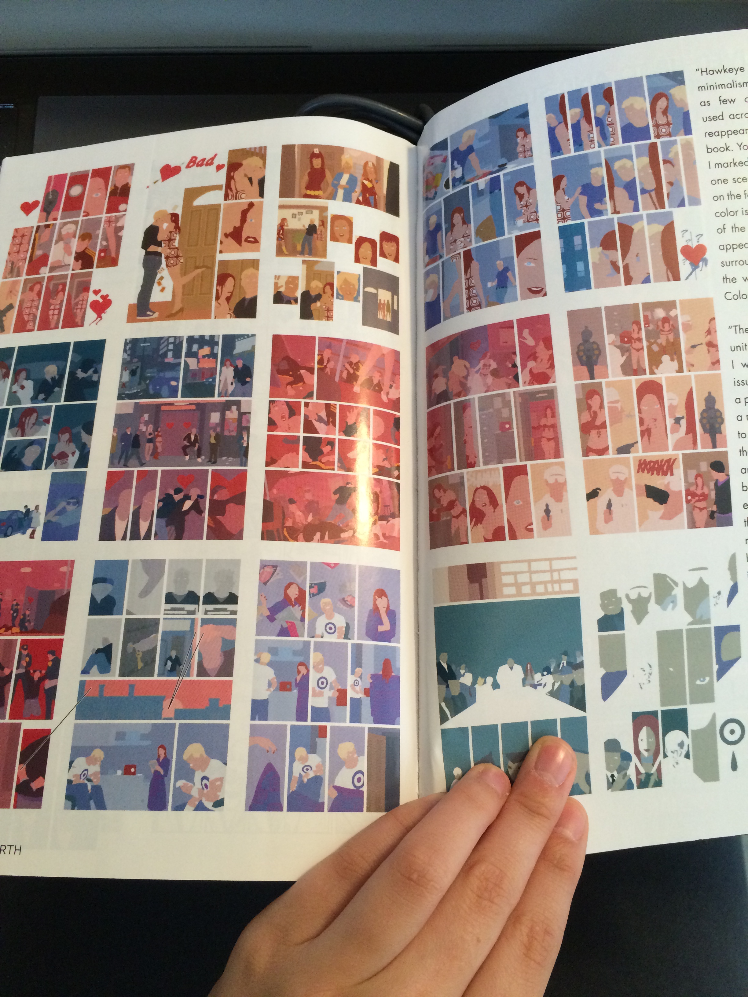
While I love Hawkeye’s look and art direction, it isn’t exactly the light fun mood I’m trying to get across with my comic. During my normal perusing of the internet I happened across Dan Hipp’s blog. Dan Hipp is the art director for Cartoon Network’s show Teen Titans Go. Which is the more stylized and colorful version of the show Teen Titans, based on DC comic characters.


Immediately I was drawn to Hipp’s use of colors. His images are saturated, but don’t strain the eyes. They are fun and full of life, and all his bright colors mesh super well. I decided to take a few of his stuff that I really like and deconstruct how he’s using color for a personal reference.

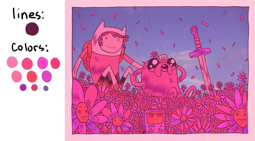
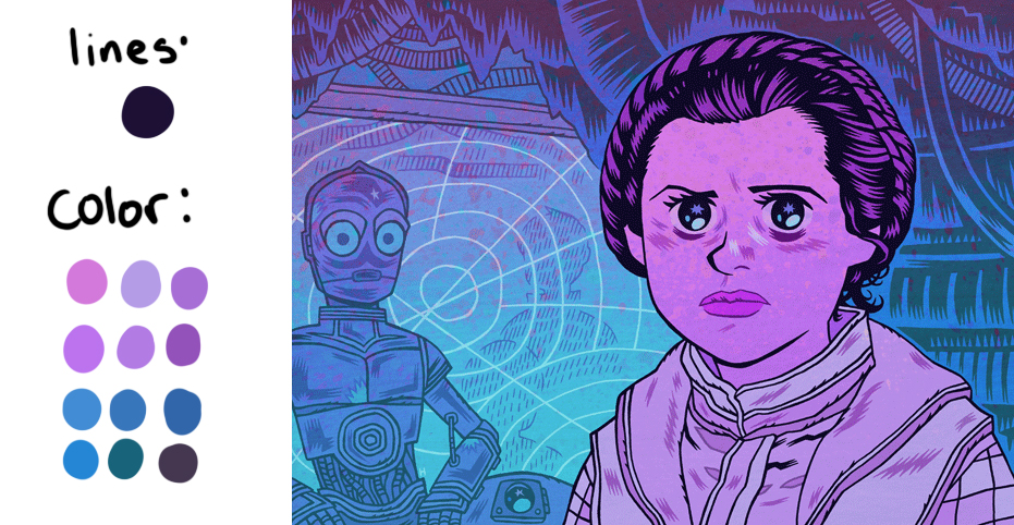
From here I started to play around with possible pallets for various parts of the comic. I know I want to have the real world be somewhat dreary, so I’m looking at something less saturated and more monochromatic. Where I want the magical world to be a lot more saturated. I was originally considering having Pen and Milo’s story lines have contrasting colors, but I have since decided against that, and I’m going to focus more on the colors of different environments to create the contrast I need on the page.

I felt my break was fairly productive. After a good discussion during my end of semester review I started revising and reworking the story. I finished thumbnailing the reworked story and got the page count from 60+ to around 49 story pages.
That might not seem like much but it involved cutting things that I didn’t necessarily want to cut, and combining and changing to storyline so its less convoluted and gets from A to B quicker.
Right now I’m working on getting the thumbnails into larger roughs so I can start inking as soon as possible.
I’ve forgotten to post these last few weeks, but I’ve been working very steadily. I also got a fairly major studio upgrade, when my parents brought up my Dad’s old drafting table for me.
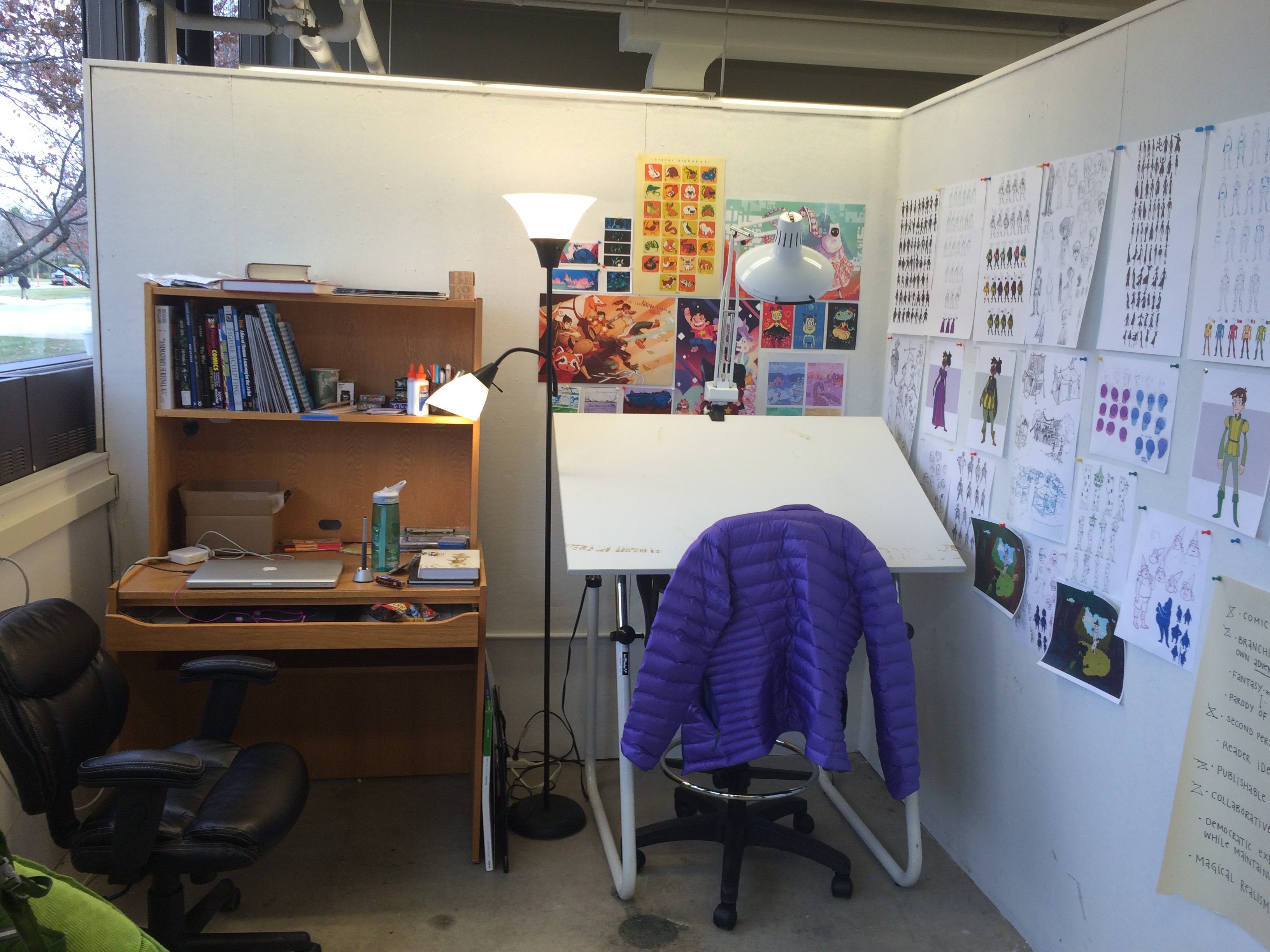
I’ve been working to rough more pages, and currently I have about 14 large roughs, which comprises sections 1-4 of the story. I am going to go back and revise certain pages that I don’t feel are working as well. Particularly the first section, which I’ve already re-roughed at a small scale.

I have also talked to Phoebe Gloeckner about my project. She suggested that I take more time in my review presentation to walk the panel through my story, if just one possible path that could be taken. She thought that this would give a better idea of what the panel could expect from the longer story as a whole, since the nature of the non-linear story is hard to summarize concisely.
Coming from the conversation I had with Phoebe I have also created a very abridge version of my story that is about 3 pages. I summarized each story section into 3-4 sentences to make it easier to quickly go through the story as a whole. I’m planning to send this to the panel along with my updated project proposal.
I have also been playing around with creating a font out of my handwriting. This is the first test I did, there are still a few errors, especially with a few of the capitals. I’m planning to have a nice font by the end winter break.

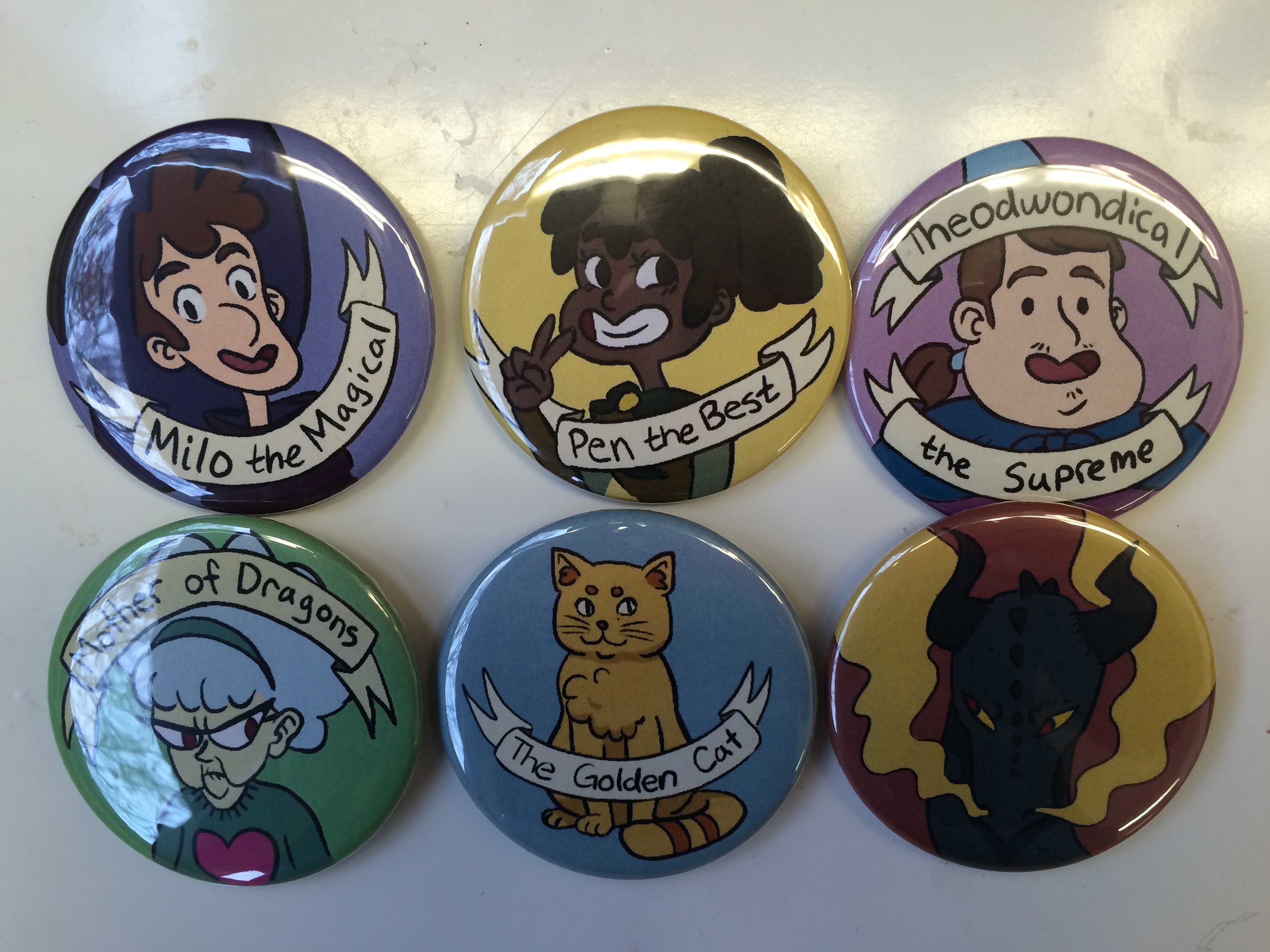
As a side note, in my digital painting class Phoebe had us all make buttons one day and I made this cute set of all the characters of my comic! I felt like I was getting into a little bit of rut only roughing and drawing the buttons was the perfect thing to get me really excited about my project again.